First impressions matter, especially in the legal profession. An attorney’s letterhead is more than just stationery; it’s a visual representation of their firm’s brand, professionalism, and attention to detail. This comprehensive guide delves into the art and science of designing effective attorney letterheads, covering everything from essential design elements and legal considerations to software options and compelling examples. We’ll explore how to craft a letterhead that not only looks professional but also adheres to ethical standards and effectively communicates your firm’s identity.
From understanding the crucial components of a successful design – including font choices, color palettes, and logo integration – to navigating the legal and ethical implications of letterhead use, this guide provides a practical framework for creating a letterhead that projects competence and builds client trust. We’ll also examine various design styles, offer practical advice on incorporating firm details, and explore the software tools available to bring your vision to life. Ultimately, this guide aims to equip you with the knowledge and resources to create a letterhead that truly reflects your firm’s unique character and professional standing.
Understanding Attorney Letterhead Design Elements
A well-designed attorney letterhead is more than just stationery; it’s a crucial component of your professional brand, projecting competence, authority, and trustworthiness to clients and colleagues. A thoughtfully crafted letterhead reinforces your firm’s identity and contributes significantly to the overall impression you make.
A professional attorney letterhead should convey a sense of sophistication and reliability. This is achieved through careful consideration of various design elements working in harmony.
Essential Components of a Professional Attorney Letterhead
The core elements of a successful attorney letterhead include the firm’s name and logo (if applicable), contact information (address, phone number, fax number, email address, and website), and potentially the names and titles of key personnel. The arrangement of these elements should be balanced and easy to read, avoiding clutter while ensuring all essential information is readily accessible. Additional elements such as a tagline or a subtle background design can be included, but should always remain secondary to the core information.
Consistent Font and Typography
Maintaining consistency in font and typography is paramount. Using a variety of fonts creates a visually jarring effect, detracting from the overall professionalism. Selecting a legible and sophisticated serif or sans-serif font is recommended. The font should be used consistently throughout the letterhead and all firm communications for brand recognition and a unified brand image. Variations in font size should be used strategically to highlight key information, such as the firm name, but should still maintain a cohesive look. For instance, a slightly larger font size for the firm name and a smaller font size for the contact details ensures readability and visual hierarchy.
Incorporating a Firm Logo and Contact Information
The firm logo, if one exists, should be prominently displayed, usually at the top left or center. The logo should be high-resolution and reflect the firm’s brand identity. Contact information should be clearly displayed, typically below the logo or to the right, ensuring easy accessibility. Consider using a consistent font style and size for contact details to maintain visual harmony. The use of icons for phone, email, and website can enhance readability and visual appeal. For example, a small phone icon next to the phone number improves visual clarity and guides the reader’s eye.
Effective Color Palettes for Attorney Letterheads
The color palette chosen significantly impacts the overall impression. Traditional and conservative color schemes, such as navy blue, dark green, or charcoal grey, often convey a sense of stability and trust. However, more modern firms may opt for subtle variations, incorporating lighter shades or complementary accent colors. Avoid overly bright or jarring colors that could be perceived as unprofessional. The use of color should be subtle and tasteful, enhancing the overall design rather than dominating it.
| Firm Name | Color Palette | Font | Overall Impression |
|---|---|---|---|
| Smith & Jones, LLP | Navy blue and silver | Garamond | Classic, trustworthy, established |
| Modern Legal Solutions | Deep teal and light grey | Open Sans | Sophisticated, modern, approachable |
| Apex Law Group | Charcoal grey and gold | Times New Roman | Elegant, prestigious, high-end |
| Miller & Associates | Dark green and cream | Lato | Calm, reliable, experienced |
Legal and Ethical Considerations in Letterhead Design
Attorney letterhead design, while seemingly a minor detail, carries significant legal and ethical weight. The design and use of a firm’s letterhead directly impact the perception of professionalism, client trust, and ultimately, the legal standing of the firm and its attorneys. Misuse can lead to disciplinary action or even legal challenges.
Legal Implications of Using a Firm’s Letterhead
The use of a law firm’s letterhead implies an association between the firm and the content of the communication. This means that the firm is legally responsible for the accuracy and propriety of the information contained within any document bearing its letterhead. False or misleading information presented on letterhead could expose the firm to liability for misrepresentation or fraud. Furthermore, unauthorized use of the letterhead by a former employee or non-attorney could create legal complications and potentially damage the firm’s reputation. The letterhead itself can be considered evidence in legal proceedings, highlighting the importance of maintaining its accuracy and consistency.
Ethical Standards Related to Attorney Letterhead Design
Ethical rules of professional conduct, often dictated by state bar associations, govern attorney advertising and communication. These rules often address the content and presentation of information on letterhead, emphasizing accuracy and avoiding misleading or deceptive representations. For instance, the use of titles or designations that are not legitimately earned is strictly prohibited. Similarly, the letterhead should accurately reflect the firm’s name, address, and contact information, avoiding any ambiguity or potential for confusion. Ethical considerations also extend to the overall tone and appearance of the letterhead, ensuring it projects an image of professionalism and competence, without being ostentatious or misleading.
Potential Issues Arising from Improper Letterhead Use
Improper use of a law firm’s letterhead can lead to a variety of problems. For example, using outdated contact information can create confusion and delay responses. Including misleading statements about the firm’s expertise or experience could constitute unethical advertising. The unauthorized use of the letterhead by a non-lawyer to communicate on behalf of the firm could expose the firm to disciplinary action and malpractice claims. A letterhead that is visually cluttered or unprofessional can negatively impact the perception of the firm’s competence and trustworthiness. In cases involving multiple attorneys or locations, a poorly designed letterhead may cause confusion regarding which attorney or office is responsible for a particular communication.
Examples of Problematic Design Elements
A letterhead featuring a logo that closely resembles that of another established firm could lead to accusations of trademark infringement. Including exaggerated or unsubstantiated claims of success or expertise on the letterhead could be considered deceptive advertising, leading to ethical violations and potential legal repercussions. For example, claiming to be “the best personal injury lawyers in the state” without verifiable data to support the assertion is problematic. Similarly, using a letterhead design that suggests a specialized practice area when the firm does not have the requisite expertise to handle such cases is also unethical. The use of overly flashy or distracting design elements could undermine the professional image the firm seeks to project. Finally, a letterhead lacking clear contact information or failing to properly identify the firm and its attorneys could cause confusion and hinder effective communication.
Analyzing Different Letterhead Styles
Attorney letterhead design significantly impacts the firm’s professional image. The choice between traditional and modern styles, or even a minimalist approach, directly influences how clients and colleagues perceive the firm’s values and expertise. Careful consideration of layout, typography, and imagery is crucial for creating a letterhead that effectively communicates professionalism and trustworthiness.
The selection of a letterhead style reflects the firm’s brand identity and target audience. A traditional design often projects an image of established authority and experience, while a modern design may convey innovation and forward-thinking. A minimalist approach emphasizes clarity and sophistication. Understanding these distinctions is key to selecting the most appropriate style for a law firm’s specific needs and goals.
Comparison of Traditional and Modern Letterhead Styles
Traditional and modern attorney letterhead styles offer distinct visual approaches. Traditional designs often utilize classic serif fonts, formal layouts, and subtle embellishments, evoking a sense of established authority and timelessness. Conversely, modern letterheads frequently employ sans-serif fonts, clean lines, and bold color palettes, projecting a contemporary and innovative image. The choice between these styles significantly impacts the overall impression a firm conveys.
Layout Choices and Their Effects
Different layout choices profoundly affect the perceived professionalism and sophistication of an attorney’s letterhead. Factors such as the placement of the firm’s logo, the use of white space, and the organization of contact information all contribute to the overall aesthetic appeal and readability. A well-designed letterhead uses visual hierarchy to guide the reader’s eye, ensuring that key information, such as the firm’s name and contact details, is prominently displayed. Conversely, a poorly designed letterhead can appear cluttered and unprofessional, undermining the firm’s credibility.
Letterhead Style Comparison Table
| Style | Description | Pros | Cons |
|---|---|---|---|
| Traditional | Employs serif fonts, formal layout, often includes embossed elements or subtle textures, typically uses a muted color palette. | Projects established authority and trustworthiness; conveys a sense of history and stability. | Can appear dated or overly formal to some; may not appeal to younger or more modern clients. |
| Modern | Utilizes sans-serif fonts, clean lines, bold color accents, often incorporates modern imagery or graphic elements. | Conveys innovation and forward-thinking; projects a contemporary and dynamic image; appeals to a broader range of clients. | May appear less established or traditional to some clients; requires careful execution to avoid appearing overly simplistic or unprofessional. |
| Minimalist | Features a clean and uncluttered design; uses a limited color palette (often monochrome); emphasizes typography and negative space. | Projects sophistication and clarity; conveys a sense of efficiency and professionalism; is highly versatile and adaptable. | May appear too simple or lack personality to some; requires careful consideration of font choice and spacing. |
Three Distinct Letterhead Mockups
The following descriptions detail three distinct letterhead mockups, each representing a different style:
Traditional Mockup: This letterhead uses a classic serif font like Garamond or Times New Roman for the firm’s name and contact information. The firm’s logo, perhaps a simple and elegant emblem, is positioned centrally at the top. A subtle watermark, perhaps a repeating pattern or a muted texture, is incorporated in the background. The color palette is limited to sophisticated shades of navy blue and gray, conveying a sense of stability and tradition. Contact details are neatly arranged at the bottom.
Modern Mockup: This letterhead employs a clean sans-serif font like Helvetica or Open Sans. The firm’s name is prominently displayed in a bold, contemporary typeface. A vibrant color accent, such as a deep teal or a rich burgundy, is used sparingly to highlight key elements, such as the firm’s logo, which might be a stylized graphic representation of the firm’s name or a relevant symbol. The layout is clean and uncluttered, with ample white space. Contact details are arranged in a concise and easily readable format.
Minimalist Mockup: This letterhead utilizes a single, high-quality sans-serif font throughout. The firm’s name is presented simply and elegantly, possibly in a slightly larger font size to create visual emphasis. The logo, if included, is minimal and unfussy. The color palette is strictly monochrome, perhaps black ink on high-quality white paper. The layout is incredibly clean, maximizing the use of white space to create a sense of sophistication and understated elegance. Contact details are presented concisely at the bottom.
Creating Effective Letterhead Content
A well-designed letterhead is more than just aesthetically pleasing; it’s a crucial component of a law firm’s professional image and brand identity. Effective letterhead content clearly and concisely communicates essential information, reinforcing credibility and professionalism. This section will explore best practices for creating impactful letterhead content.
Incorporating Firm Name, Address, and Contact Details
The firm’s name, address, and contact information are fundamental elements of any letterhead. These details must be prominently displayed, easily readable, and accurately reflect the firm’s current information. The firm name should be the most prominent element, often using a larger, bolder font. The address should follow, typically including street address, city, state, and zip code. Contact information, such as phone number, fax number (if applicable), and email address, should be clearly listed below. Consider using a consistent font and size for all contact details to maintain visual harmony. For example, a prominent display of “Smith & Jones, Attorneys at Law” in a bold, serif typeface could be followed by the address in a slightly smaller, but still easily readable, sans-serif font, and then contact information in the same sans-serif font but a smaller size.
Examples of Professional and Concise Wording
Using concise and professional language is paramount. Avoid jargon or overly formal language. The goal is clarity and immediate understanding. Instead of “Esquire,” which is often perceived as outdated, consider using “Attorneys at Law” or simply “Lawyers.” For the address, use a standard format to ensure readability and consistency. Avoid abbreviations unless widely understood. For example, “123 Main Street, Anytown, CA 91234” is preferable to “123 Main St., Anytown, CA 91234.” Similarly, “Phone: (555) 123-4567” is clearer than “Tel: 555-123-4567.”
Importance of Clear and Legible Font Sizes and Styles
Choosing appropriate font sizes and styles is crucial for readability and overall aesthetic appeal. The firm name should be easily visible, typically using a larger font size (e.g., 18-24 points) in a bold, easily readable serif or sans-serif font. The address and contact details should use a smaller, but still legible, font size (e.g., 10-12 points). Avoid overly decorative or difficult-to-read fonts. Maintain consistency in font style throughout the letterhead to create a cohesive and professional look. Consider using a serif font for the firm name to add a touch of formality and a sans-serif font for the contact details for improved readability of smaller text.
Sample Letterhead Text for Different Legal Practices
Here are examples tailored to different legal specializations:
Family Law Firm:
Smith & Jones, Attorneys at Law
Specializing in Family Law
123 Main Street, Anytown, CA 91234
Phone: (555) 123-4567 | Fax: (555) 123-4568 | Email: [email protected]
Corporate Law Firm:
Miller & Associates, Attorneys at Law
Corporate & Business Law
456 Oak Avenue, Suite 100, Big City, NY 10001
Phone: (212) 555-7890 | Email: [email protected]
Criminal Defense Firm:
Defense Advocates, Attorneys at Law
Criminal Defense Specialists
789 Pine Street, Smallville, TX 75000
Phone: (512) 555-0000 | Email: [email protected]
Exploring Different Software Options for Letterhead Creation
Creating a professional and effective attorney letterhead requires careful consideration of the design software used. The choice of software impacts the ease of design, the level of customization, and the final output quality. Different programs offer varying levels of functionality and user-friendliness, making the selection process crucial for achieving the desired results.
Software Options for Letterhead Design
Several software options cater to the needs of creating attorney letterheads, each with its own strengths and weaknesses. The best choice depends on the designer’s experience, budget, and the complexity of the desired design.
- Microsoft Word: A widely accessible and user-friendly option, ideal for simple letterhead designs. Its ease of use makes it suitable for those with limited design experience. However, it offers limited advanced design features compared to dedicated graphic design software.
- Adobe InDesign: A professional-grade software offering extensive control over typography, layout, and design elements. Ideal for complex and intricate designs, it allows for precise placement and manipulation of elements. However, it has a steeper learning curve and requires a subscription.
- Adobe Photoshop: Primarily an image editing software, Photoshop can be used to create letterhead designs, particularly those with complex imagery or photo manipulations. It excels in image editing but may not be the most efficient for text-heavy layouts.
- Canva: A user-friendly online design tool with pre-designed templates and intuitive drag-and-drop functionality. It offers a balance between ease of use and design capabilities, making it a good choice for those who need a quick and easy solution. However, customization options may be limited compared to professional software.
Advantages and Disadvantages of Different Software
The selection of software hinges on balancing the desired level of control with the user’s technical skills and available resources. For example, while Microsoft Word’s simplicity is advantageous for beginners, its limitations may hinder the creation of sophisticated designs. Conversely, Adobe InDesign’s advanced features empower experienced designers but require a significant time investment to master. Canva’s ease of use and affordability are attractive, but its limitations in advanced features might prove restrictive for complex designs.
Creating a Letterhead in Microsoft Word
Creating a letterhead in Microsoft Word involves a straightforward process. First, create a new document and adjust the page margins to accommodate the letterhead elements. Then, add your law firm’s logo (using Insert > Pictures), firm name, address, phone number, email address, and website URL. Use different font sizes and styles to create visual hierarchy and ensure readability. Precise placement of elements can be achieved using rulers and guides. Finally, save the document as a template for future use.
Saving and Exporting the Letterhead
Saving the letterhead as a template within the chosen software allows for easy reuse. Exporting the final design in various formats caters to different needs. Saving as a PDF (.pdf) preserves the formatting and ensures consistent appearance across different devices and operating systems. Exporting as a JPEG (.jpg) or PNG (.png) image file is suitable for online use or for embedding the letterhead into other documents. The specific export options vary depending on the software used; however, most programs offer a range of resolution and compression settings to optimize file size and quality.
Illustrative Examples of Attorney Letterheads
To effectively convey professionalism and brand identity, law firms carefully design their letterheads. The following examples showcase diverse approaches, highlighting the impact of visual elements on the overall impression.
Example 1: The Traditional Approach
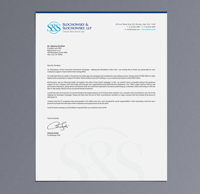
This letterhead employs a classic, understated design. The firm’s name is prominently displayed in a serif typeface like Times New Roman or Garamond, perhaps embossed for a tactile element. The font size is relatively large, ensuring readability. The color scheme is simple, using dark blue or black ink on crisp white paper. Contact information, including address, phone number, and email, is neatly arranged below the firm name. A subtle, understated logo, perhaps a simple emblem or monogram, might be included in a corner. This approach projects an image of established credibility and trustworthiness, suitable for firms specializing in areas like corporate law or estate planning. The conservative layout reinforces a sense of stability and experience.
Example 2: The Modern Minimalist Approach
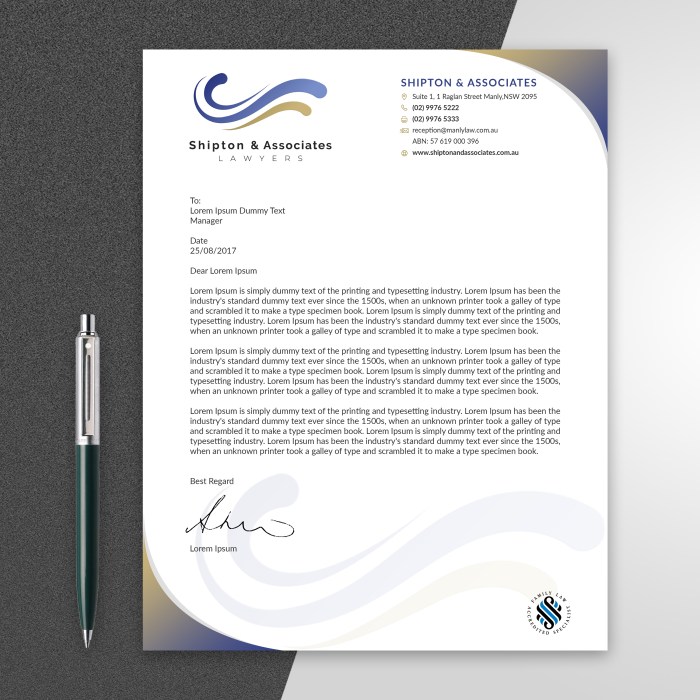
In contrast, a modern minimalist letterhead prioritizes clean lines and a contemporary aesthetic. A sans-serif typeface such as Helvetica or Open Sans is used for its clarity and modern feel. The firm’s name is presented simply, often in a bold, slightly larger font size. Color palettes might incorporate a single accent color, perhaps a deep teal or a muted gray, against a white background. The layout is uncluttered, with contact information placed concisely. A simple, geometric logo is often featured, reflecting a modern and efficient brand image. This style is particularly effective for firms specializing in technology law, intellectual property, or other forward-thinking areas. The clean lines and modern font choices project an image of innovation and efficiency.
Example 3: The Specialized Approach
A specialized law firm might employ a letterhead that directly reflects its area of practice. For example, a personal injury law firm might use a bolder color scheme, perhaps incorporating a deep red or a strong blue to convey a sense of strength and advocacy. The font choice might be slightly more assertive, and the layout could include imagery subtly related to safety or justice, such as a stylized scale of justice or a silhouette of a supportive hand. Contact information would be prominently displayed. This approach immediately communicates the firm’s area of expertise and creates a memorable impression. The use of color and imagery helps to build brand recognition and target a specific client base.
Last Recap
Designing an effective attorney letterhead is a multifaceted process requiring careful consideration of both aesthetic and legal aspects. By understanding the key design elements, adhering to ethical standards, and utilizing appropriate software, law firms can create a letterhead that projects professionalism, reinforces their brand identity, and contributes to a positive client experience. This guide has provided a comprehensive overview of the process, offering practical advice and illustrative examples to help you craft a letterhead that effectively represents your firm and its commitment to legal excellence.
FAQ Overview
What are the common mistakes to avoid when designing an attorney letterhead?
Common mistakes include using illegible fonts, clashing color palettes, overcrowding the design, and neglecting legal and ethical considerations regarding firm information.
Can I use a generic template for my attorney letterhead?
While using a template can save time, it’s crucial to customize it to reflect your firm’s unique brand and ensure compliance with legal and ethical requirements. A generic template may lack the professional touch expected from a legal practice.
How often should I update my attorney letterhead?
Updating your letterhead is advisable when your firm’s branding changes, your contact information alters, or if the design becomes outdated. Regularly reviewing your letterhead for relevance is good practice.
What file formats are best for saving my attorney letterhead?
PDF is generally preferred for its print quality and ability to maintain formatting across different devices and software. JPG or PNG are suitable for online use.