The seemingly simple business card, for an attorney at law, holds significant weight. It’s the first impression, a silent ambassador representing years of legal expertise and professional standing. This guide delves into the multifaceted world of attorney business cards, exploring the legal nuances of using the title “Attorney at Law,” the art of effective design, and the ethical considerations that must underpin every aspect of its creation and distribution.
From understanding jurisdictional requirements for using the term “Attorney at Law” to crafting a visually compelling design that speaks to a specific target audience, we’ll cover the key elements that contribute to a successful and professional business card. We’ll also address practical considerations like printing options and distribution strategies, ensuring your card not only looks professional but also effectively promotes your legal practice.
Branding and Design Considerations

A business card is often the first physical impression a potential client receives of an attorney. Therefore, the branding and design are crucial for conveying professionalism, competence, and the specific legal niche the attorney serves. Careful consideration of visual elements directly impacts how clients perceive the attorney’s practice and ultimately, their decision to engage their services.
The choice of font, color scheme, and overall design significantly influence the perceived professionalism of a business card. A cluttered or poorly designed card can undermine even the most accomplished attorney’s reputation, while a well-designed card can enhance their credibility and memorability.
Font Choice Impact
The typeface selected significantly impacts the card’s overall feel. Serif fonts (like Times New Roman or Garamond) generally project a traditional and established image, often suitable for attorneys specializing in corporate law or estate planning. Sans-serif fonts (like Arial or Helvetica) tend to convey a more modern and clean aesthetic, potentially better suited for attorneys focused on technology law or intellectual property. Legibility is paramount; overly stylized or decorative fonts can be difficult to read and detract from professionalism. Using a consistent font family across headings and body text maintains visual harmony.
Color Scheme Effectiveness
Color psychology plays a vital role in business card design. Darker, more muted colors like navy blue or deep green often suggest stability and trustworthiness, while lighter colors might project a more approachable and friendly image. The use of color should align with the brand identity and legal specialty. For instance, a corporate lawyer might opt for sophisticated navy blue and gold, whereas a family law attorney might prefer softer blues and greens. Overuse of bright, clashing colors can appear unprofessional and distracting. Maintaining a consistent color palette across all marketing materials is essential for brand recognition.
Examples of Effective and Ineffective Designs
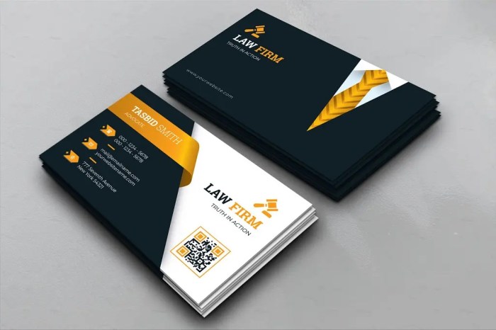
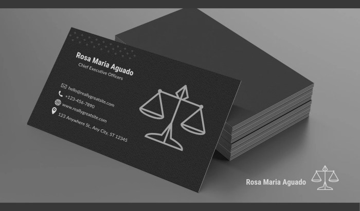
An effective business card for an attorney might feature a clean, minimalist design with high-quality paper stock. A simple, elegant logo, crisp typography, and strategically placed contact information create a professional and memorable impression. Ineffective designs often include cluttered layouts, low-resolution images, or overly decorative elements that detract from readability and professionalism. A card with faded colors or a cheap paper stock can also negatively impact the perceived professionalism. Consider the contrast between a card with a simple, elegant logo and a clean layout versus one crammed with information and low-quality graphics. The difference in perceived professionalism is immediately apparent.
Design Concept for an Attorney’s Business Card
This design concept envisions a business card for a corporate attorney. The card uses a high-quality, slightly textured off-white card stock. The logo, a stylized abstract representation of a balanced scale, is printed in a sophisticated navy blue, placed subtly in the upper left corner. The attorney’s name and title are printed in a clean, elegant serif font (Garamond) in navy blue. Contact information (phone number, email address, and website) is presented in a smaller, sans-serif font (Arial) in a lighter gray, neatly aligned below. The back of the card could feature a subtle embossed pattern or a short tagline reflecting the attorney’s specialization, printed in a matching navy blue. This combination of sophisticated colors, clean typography, and high-quality materials creates a professional and memorable impression.
Design Elements for Different Legal Specialties
The design elements should be tailored to the specific legal specialty. Careful consideration of these aspects ensures the business card effectively communicates the attorney’s expertise and brand identity.
- Corporate Law: Sophisticated color palettes (navy blue, gold, gray), clean and minimalist design, high-quality paper stock, professional serif or sans-serif fonts, possibly incorporating subtle imagery related to business or finance.
- Family Law: Softer color palettes (blues, greens, pastels), a more approachable and empathetic design, possibly incorporating imagery subtly representing family or connection (but avoid overly sentimental images), clear and easy-to-read fonts.
- Criminal Law: Strong, bold color palettes (darker blues, grays, possibly accents of red for impact, but use sparingly), a design that conveys strength and confidence, but avoids being overly aggressive, clear and easily readable font choices.
- Personal Injury Law: A design that conveys empathy and support, possibly incorporating subtle imagery representing healing or recovery (again, avoid overly graphic or sentimental imagery), use of color schemes that project trustworthiness and competence.
Professionalism and Ethics

Maintaining ethical standards is paramount for attorneys, extending to all aspects of their practice, including marketing materials such as business cards. A professional and ethically sound business card reflects positively on the attorney’s competence and integrity, fostering client trust and confidence. Conversely, an unprofessional or ethically questionable card can damage reputation and potentially lead to disciplinary action.
Ethical considerations in attorney advertising, including business cards, are governed by rules of professional conduct, which vary by jurisdiction. These rules aim to prevent misleading or deceptive advertising that could unfairly influence potential clients. The overarching principle is to ensure truthful and accurate representation of the attorney’s qualifications and services.
Ethical Considerations in Attorney Advertising and Business Cards
The design and wording of an attorney’s business card must adhere to strict ethical guidelines. For instance, claims of specialization require demonstrable expertise and should not be exaggerated or misleading. Using titles or designations not legitimately earned is unethical and potentially illegal. A card boasting “Top 1% Divorce Attorney” without verifiable supporting evidence would be a clear violation. Similarly, implying a specific outcome in a case (“Guaranteed Wins!”) is unethical and prohibited. The card should convey professionalism and competence without making unsubstantiated claims. Furthermore, the use of testimonials requires consent and accuracy; misrepresenting client experiences is a serious ethical breach. The business card should accurately reflect the attorney’s area of practice; claiming expertise in an area where the attorney lacks experience is unethical and potentially harmful to clients.
Maintaining a Professional Image Through Business Card Design and Wording
A professional image is crucial for building credibility and attracting clients. The business card should reflect this through its design and wording. A clean, uncluttered layout with high-quality printing demonstrates attention to detail and professionalism. The choice of font should be legible and sophisticated, avoiding overly casual or playful styles. The use of appropriate colors and a consistent brand identity across all marketing materials reinforces professional branding. The wording should be concise, accurate, and avoid jargon or overly technical language. Contact information should be clearly displayed, including phone number, email address, and website. Including a professional headshot can further enhance the personal connection and build trust. The overall impression should be one of competence, trustworthiness, and accessibility.
Avoiding Ethical Pitfalls in the Design and Distribution of Business Cards
To avoid ethical pitfalls, attorneys must carefully review their business card design and distribution methods. Overly boastful or self-aggrandizing language should be avoided. False or misleading statements about qualifications, experience, or results must be strictly prohibited. The distribution of business cards should be targeted and appropriate; indiscriminately handing out cards in inappropriate settings (e.g., at a social event unrelated to the attorney’s practice) could be perceived as unprofessional or even unethical. Furthermore, the use of misleading imagery or graphics should be avoided. The business card should present a consistent and accurate representation of the attorney and their practice. The attorney should also be mindful of the jurisdiction-specific rules regarding attorney advertising.
Ethical Considerations Checklist for Attorney Business Cards
- Does the card accurately reflect my area(s) of practice?
- Are all claims of expertise verifiable and substantiated?
- Does the card avoid making guarantees or promises of specific outcomes?
- Is the design professional, clean, and uncluttered?
- Is the wording concise, accurate, and free of jargon?
- Have I obtained necessary consents for any testimonials or endorsements used?
- Does the card comply with all applicable rules of professional conduct regarding attorney advertising?
- Have I reviewed the card for potential misinterpretations or misleading statements?
- Is the distribution method appropriate and targeted to potential clients?
Epilogue

Creating a business card for an attorney at law requires a careful balance of legal compliance, impactful design, and ethical considerations. By thoughtfully addressing each aspect – from the precise wording and design elements to the strategic distribution methods – attorneys can leverage this small but powerful tool to cultivate a strong professional image and connect effectively with their target clients. A well-designed business card is more than just a contact; it’s a reflection of your legal expertise and commitment to professional excellence.
Quick FAQs
What are the penalties for falsely claiming to be an attorney?
Penalties vary by jurisdiction but can include significant fines, suspension or revocation of law licenses (if applicable), and even criminal charges.
Can I use abbreviations like “Atty.” or “Esq.”?
While some jurisdictions allow abbreviations, it’s best to check local regulations. Using “Attorney at Law” is generally safest and clearest.
How often should I update my business cards?
Update your cards when your contact information changes, or if your branding evolves significantly. It’s not necessary to replace them annually unless needed.
What type of paper is best for attorney business cards?
Thick, high-quality card stock (e.g., 16-pt or heavier) conveys professionalism and durability. Consider options like linen or textured paper for a premium feel.